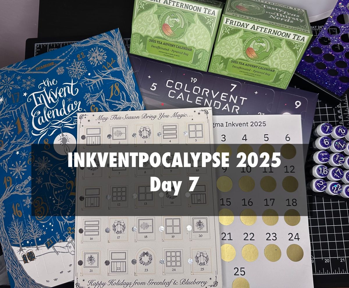
Inkventpocalypse 2025 Day 7
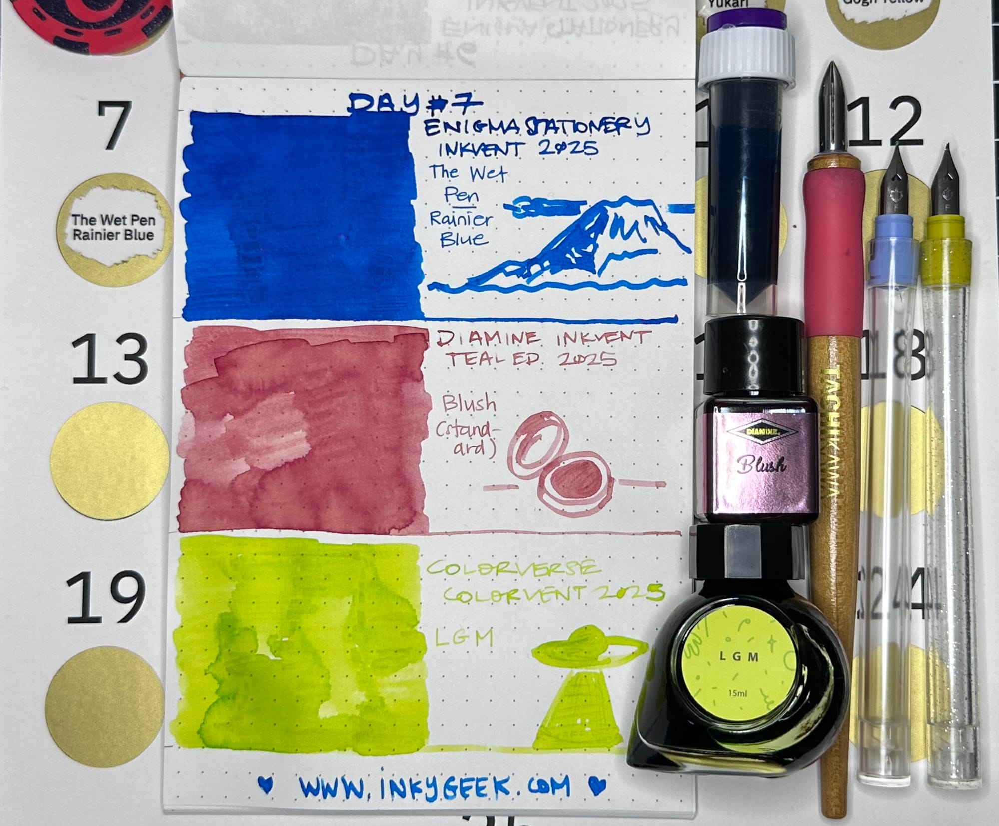
Today's *vents are three standard inks, (one I own already, one that is a bit distressing & one that is probably illegible), one vivid watercolour & one pretty good tea.
Well. This day was an unexpected experience. I'll get to that in a minute.
First up is Day 7 of Enigma Stationery's Inkvent which is The Wet Pen in Rainier Blue. This ink is VERY wet, as the name implies. It's a really juicy, saturated straight up blue, with red sheen around the edges. It takes a bit to dry, with very little shading. It is a wonderful ink formula & I adore the Pacific Northwest themes of The Wet Pen inks, I always learn something new from them. I know I am not the biggest fan of blue sheening inks (again, oversaturated), but this one is a standout because of the experience of using it. It would do well in a dry pen. The doodle is of Mt. Rainier.
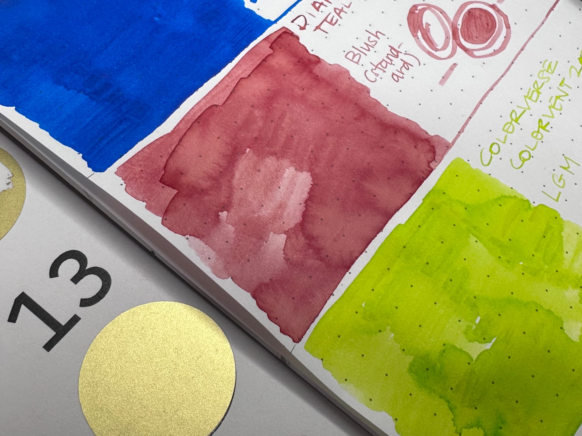
Next up is the unexpected one. Diamine Inkvent Teal Edition day 7 is in Blush, a standard ink. It applied VERY watery and strange, almost like I had something on the Kakimori nib tainting the colour. It goes on brownish with some yellow in it, too. Not at all what I was expecting. I shook the sample, washed all my nibs, dumped/refilled my rinse water, and tried again. Nope. That is just how this ink applies. We're getting a rare, wet photo in progress to hopefully better show the desaturated, watery and brownish yellow spots this swatch had (the overview is not colour accurate).
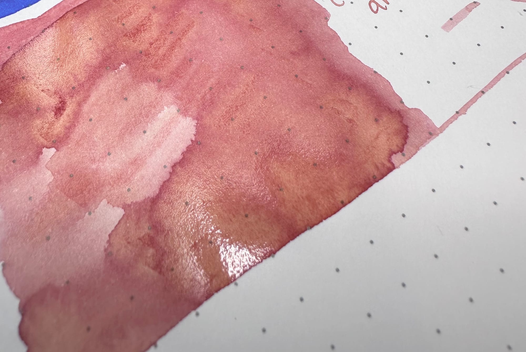
This one, I'm actually afraid to describe what I was thinking when swatching this. I have a lot of experience in the medical world and it was not pleasant imagery that this ink evoked. My absolute first thought was ... wound care related. (I'm trying VERY hard to be diplomatic here!) It's not the most appealing pink I've ever swatched and even dry it's a weird one. It's not terribly legible in the finer nibs (though it did darken up when dry) and I'm struggling to get past my initial experiences with this ink. I did doodle a blush compact to try to get my head back in a pleasant pink place.
Last ink up is Colorverse Colorvent Day 7 in "L G M" which baffled me when I initially pulled it out, but the door explained that it is short for Little Green Men. It's a highlighter chartreuse green. It was on the dry side and though it was mostly legible in the wider nibs, it wasn't easy to work with. I think in a Platinum Preppy with the chisel tip it'd make an excellent highlighter colour, there aren't many of those colours around. It's right on that mix between green & yellow. I doodled the now classic imagery of a UFO beaming something up. The door blurb says "L G M
In 1967, a rhythmic signal arrived from space. And for a moment, we all wondered — "Little green men?" "
Next up is the Greenleaf & Blueberry watercolour advent in shells. Day 7 is a primary cyan blue, Pthalocyanine Cyan pigment number PB17.
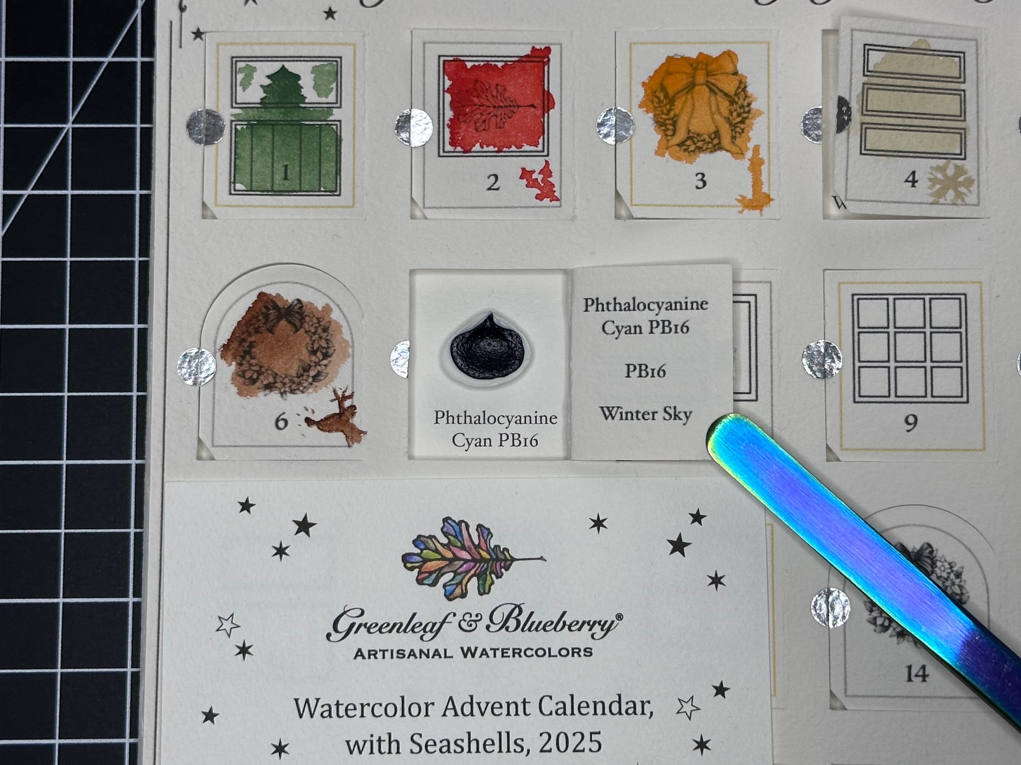
The quality of this paint is a bit different in the shell, it looked like it was less thick when it dried than the other paints have been. It is very dark when dry and a dense cyan blue when wetted out.
The swatch is a true cyan, almost like an ink. It's not terribly granulating, and was hard to get a watered down version. The info on the G&B page says that it's a synthetic/natural hybrid. My painted out version is a bit less green than the swatches show on the main website, but that could just be my browser. I tried to doodle the "winter sky" suggestion, but it just turned into a blobby single cloud.
Last up is the Friday Afternoon Tea decaf advent Day 7 which is a slightly minty, herbally comfort.
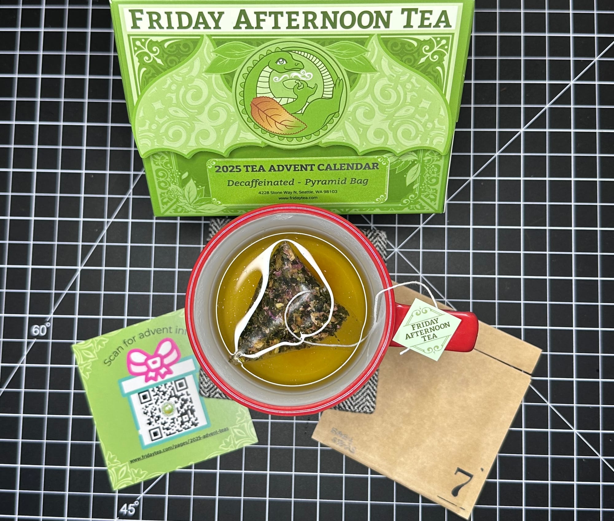
This tea is another nice one. It's called Baby Steps. I normally don't love a mint tea (toothpastey?) but this one is not at all that direction. I steeped it a bit longer than recommended and am glad I did. It isn't heavily any one of the individual ingredients (ginger, orange peel, nettle leaf, apple, rose petal, spearmint) but it is overall a nice green planty drink. It was nice both freshly brewed and after I left it on the table while swatching so it cooled. I finished this one.
This day wasn't as difficult as previous days, no special finishes, though that one Diamine ink was challenging, but I'm sure other people with fewer hospital experiences will not be quite so triggered by the separation of the pink.
A couple questions: what did Did Diamine Blush make you think of, before I mentioned anything? How much does an ink's formula (or any product for that matter) make you like it, even if you'd not normally be into it? How much do you think does a name influence how you interact with a colour? Anything you've gotten just for the name alone?
We've finished the first week! It's been a while to get here, but we'll keep on going! Thanks again for commenting, signing up and interacting elsewhere (Bluesky, Instagram - private & Inkygeeky). Happy Solstice, since I'll not have the next one up until after we've headed the other direction.