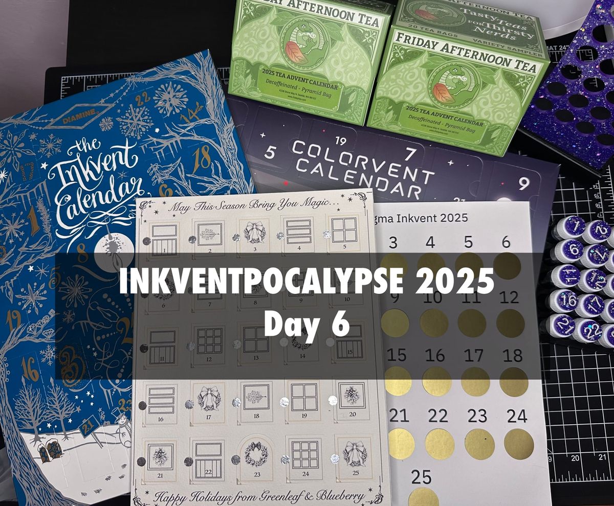
Inkventpocalypse 2025 Day 6
I'm really bad at keeping things consistent, I just noticed that day 5's title is missing the 2025 identifier and I'm not sure if I always remember to add the tags. Still still learning! Anyway, we're still doing okay with the every-other day publishing this, while doing the actual swatching/painting/drinking tea on the alternate days. Today was another decent sensory day, no scented inks & a pleasant tea.
We'll start with the Inkvents.
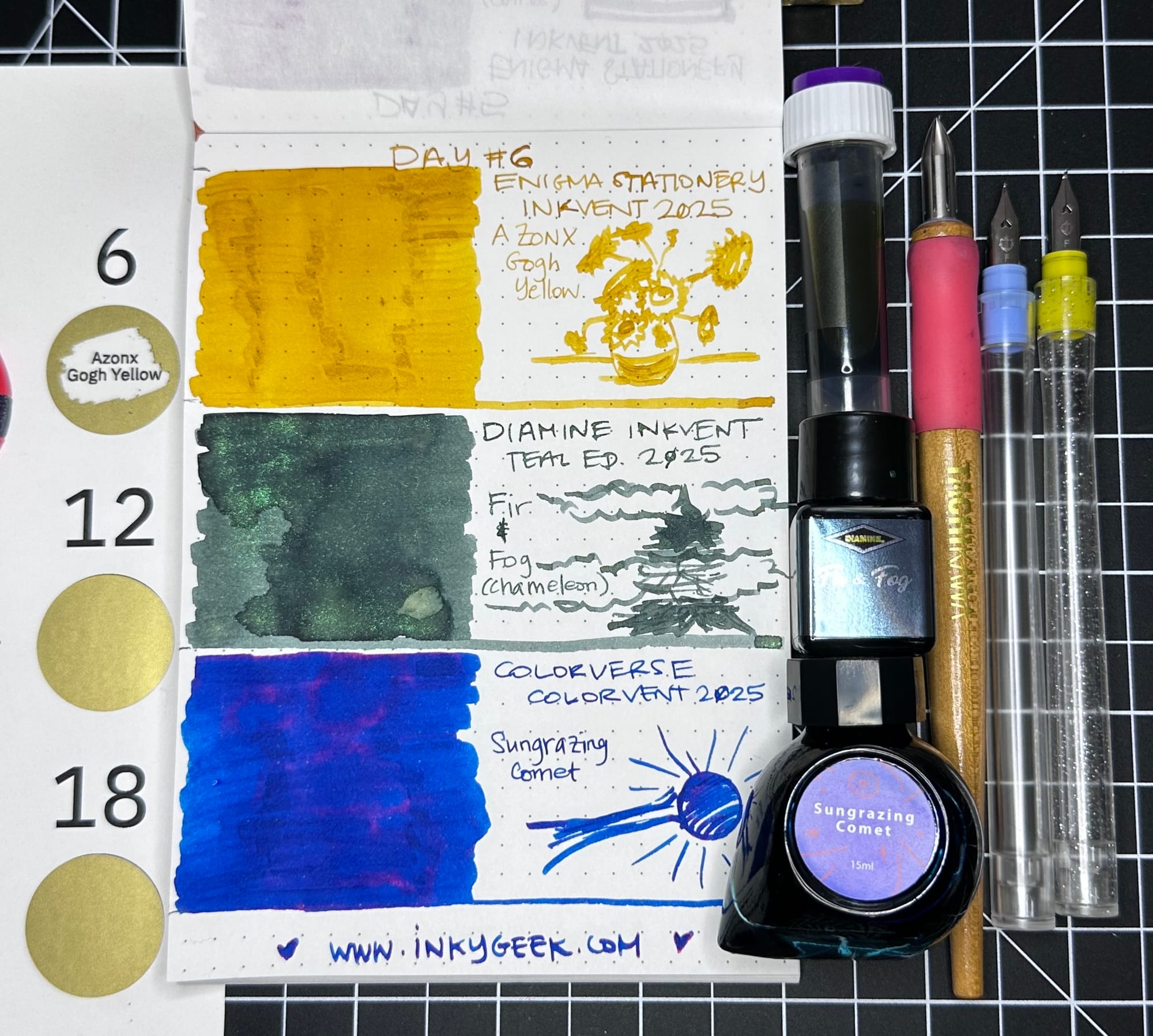
Starting with Enigma Stationery's Inkvent 2025 in AZONX Gogh Yellow. Another AZONX (x Sailor) ink, this time in a buttery slightly ochre yellow that has areas of darker shading in the heavier application areas. It's surprisingly legible in the writing and, like most Sailor inks, is well behaved and lubricated. The doodle is an interpretation of Van Gogh's Sunflowers.
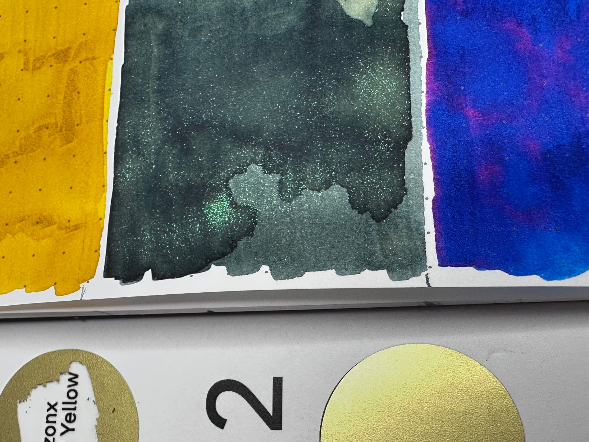
Next up is Diamine Inkvent Teal Edition 2025 Day 6 is in Fir & Fog, a chameleon ink. Diamine says their chameleon shimmers change colour depending on the angle of the light. I did not initially see that with this ink, but upon further inspection with different lighting, I did. It was just a green shimmer initially (in these photos, especially) but I am able to see a silver shimmer and a pink flash very rarely when in halogen/full spectrum lighting. The base is a dusty/desaturated grey-green ink. It is a lovely green, reminiscent of juniper or other grey-green waxy conifers. The doodle is an attempt at a foggy pine tree.
Last ink up is Colorverse Colorvent 2025 Day 6 in Sungrazing Comet. This is one of the least interesting inks that we've had so far. It's your standard (if well lubricated & nicely dense) blue ink with red sheen. I think I probably have 20 variations of this ink after doing these for so long. Granted it's a nice quality ink, but it's boring. The doodle is supposed to be of a comet interacting with the sun, but I forgot the comet (it's a doodle based on this image by the ESA). The blurb on the door says "Sungrazing Comet: A comet races toward the Sun. Its path glows briefly-then vanishes into light."
Next up is Greenleaf & Blueberry's Watercolour advent in shells Day 6.
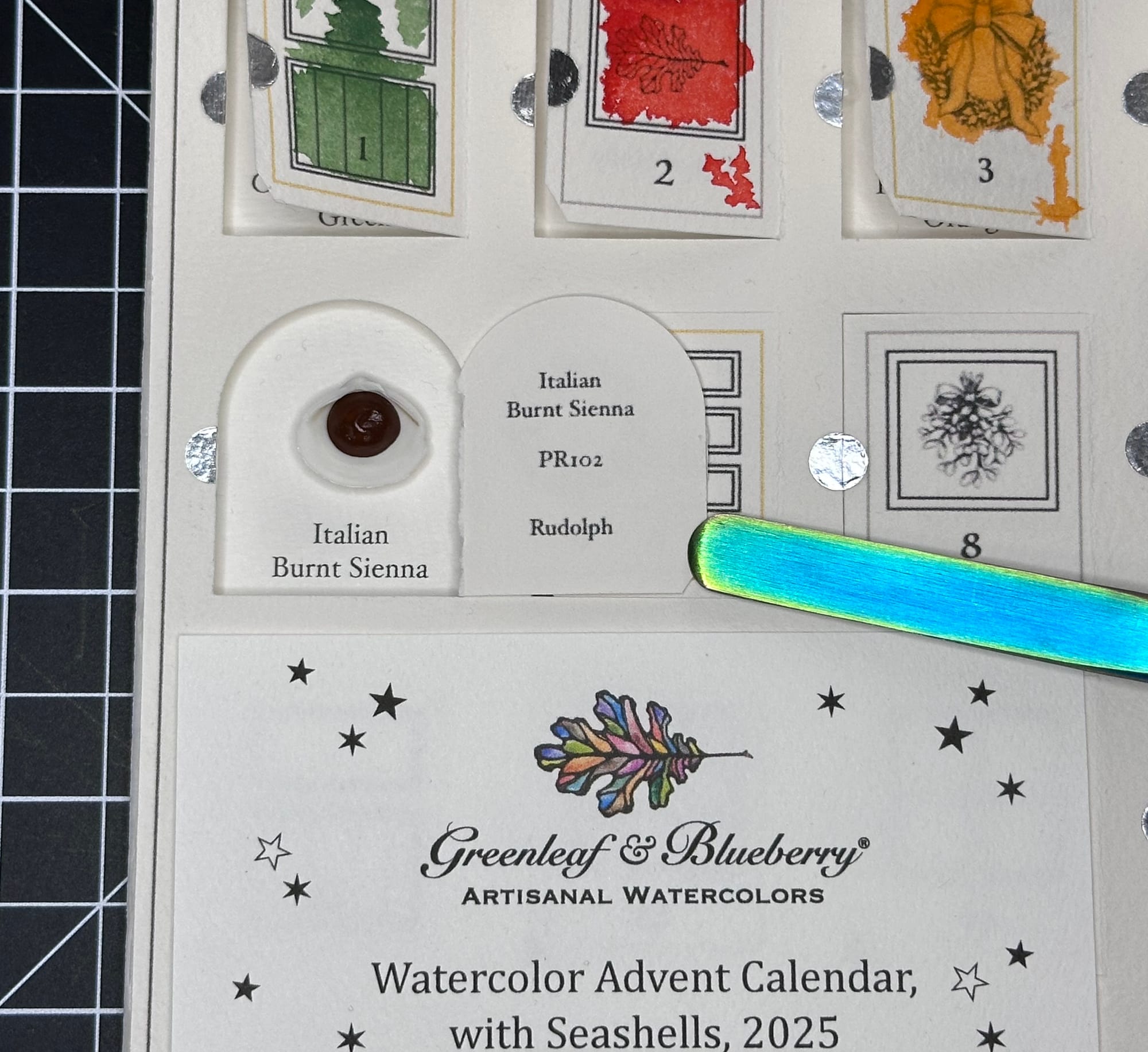
This watercolour, from what I can tell, is unavailable in pans or the main line at Greenleaf & Blueberry. It was in two different palettes (both not for sale right now). We're lucky to have so many unreleased paints to try in this calendar! The paint is Italian Burnt Sienna, a dark reddish brown with the pigment number of PR102. There are other paints called Burnt Sienna, but they are a different pigment. From what I understand, the pigment is an earth colour iron oxide that is heated and it changes the tone of the powdered pigment.
Okay, so that aside, this is a dry feeling (very hard to explain, it required a lot more water to wet the paint surface & I had to re-wet the brush several times) paint and the paint felt the slightest bit gritty, yet still dense. You can see the slightly dry edges in the paint swatch, pictured below.
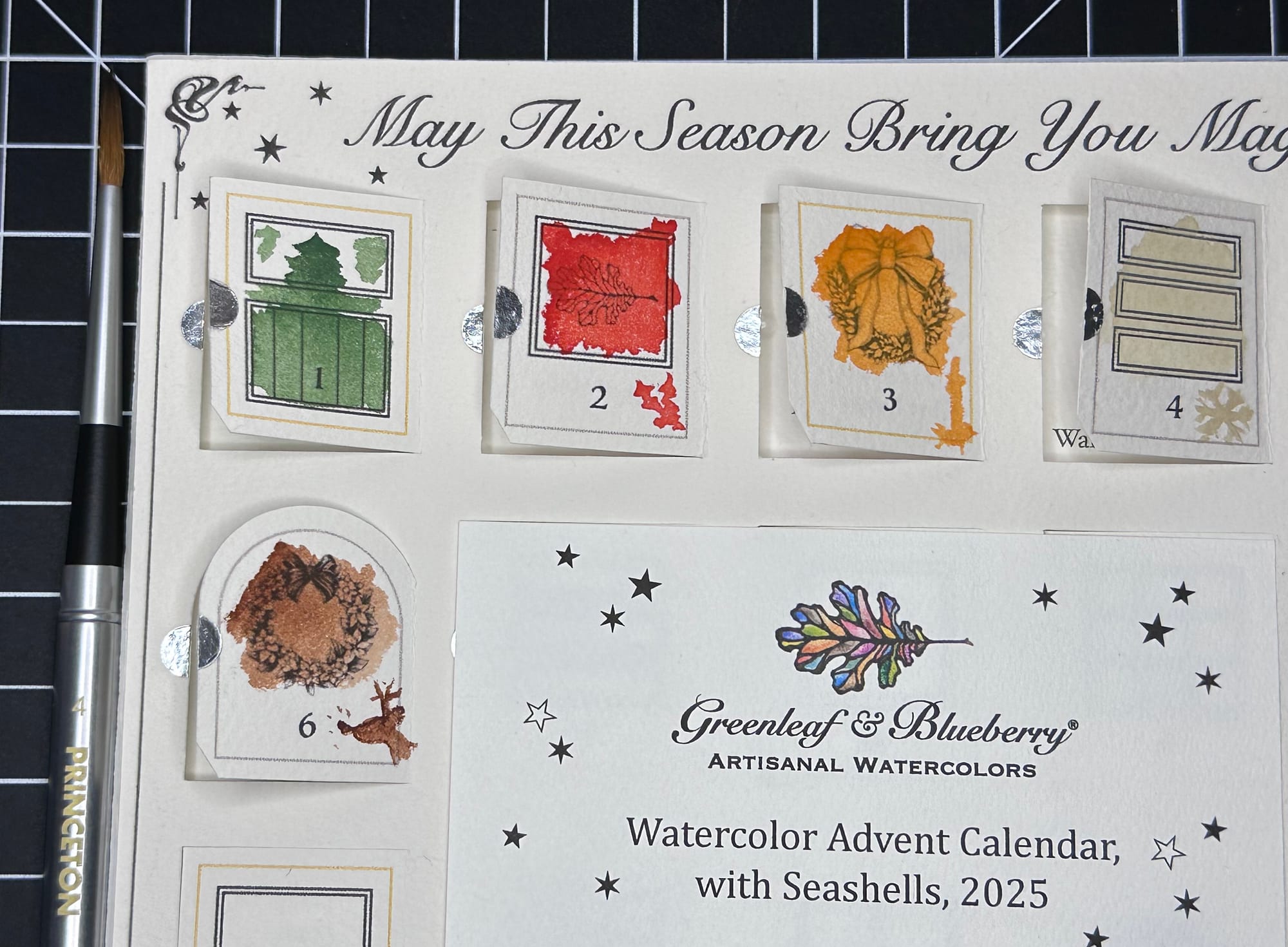
The Italian Burnt Sienna paint was quite different than the other colours, it was a bit granular feeling. It's very hard to explain in words the difference in certain pigments, which is why I am really grasping, here. You know how some Crayola Crayon colours were waxier and harder, and some were just like colouring with lipstick, almost? This is more toward the harder feeling end of the spectrum, but it wasn't unpleasant, just different.
Okay, well, that was not easy to explain at all.
Finally, we have Friday Afternoon Tea's Decaf advent in pyramid bags day 6 tea, Krishna Tulsi.
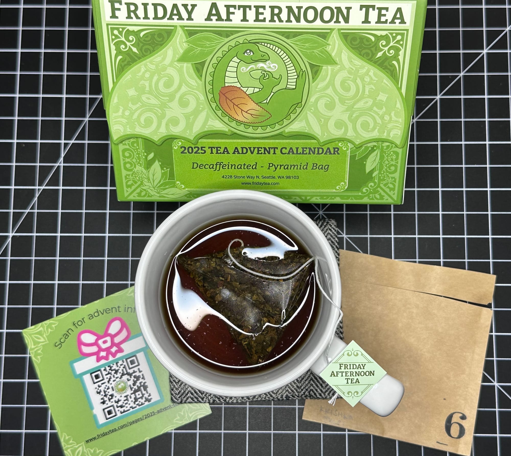
This tea is also known as Holy Basil, and according to the website, is a member of the mint family. I'm not usually a big mint fan, but this was more of an herbal, refreshing, slightly more of a roasted green tasting tea with just a touch of menthol. The vague minty-ness isn't at all toothpasty or candylike. I might have to get more of this, it's another cup I drank all of.
Well, we're almost to the end of the first 7 days of these things. Since I'm taking my sweet time with this, I'm finding that a few of the links at the Supplies & Links (Sources) post are coming up as not available or just go to the source's main site. I'll keep that linked post the same for reference, but I'm not sure what I'll do when I am able to make it a full page.
So besides broken links and lack of consistent titles, I hope things aren't too confusing. I also had a bit of a snafu with the hosting site and my domain for a bit, which is why this is even later than usual. We're back up and running now, I think. If you have any issues, just email me - subgirl@gmail.com
Now, for the questions at the end of this: What do you think of blue inks with red sheen? Are you over saturated (pun only sort of intended) or do you like them all? Would you use a yellow ink if you had the right pen for one? Did my attempts to describe painting with a dry paint just make zero sense? Does the painting of Rudolph even look like a reindeer? I did it without any reference, and I think the antlers are maybe wrong?