Inkventpocalypse 2025 Day 3

Only running a week behind, which seems to line up with where my head is. November seemed to end very late this year. Anyway, here's Day 3!
(Note before we get into this, I'm making my first attempt to send this as an email, too, so if there are issues, email me: subgirl@gmail.com )
First up is the Inkvents. The doodles for these were more difficult to figure out. There's a stylised ocean scene, a really janky carousel, and a specific crater.
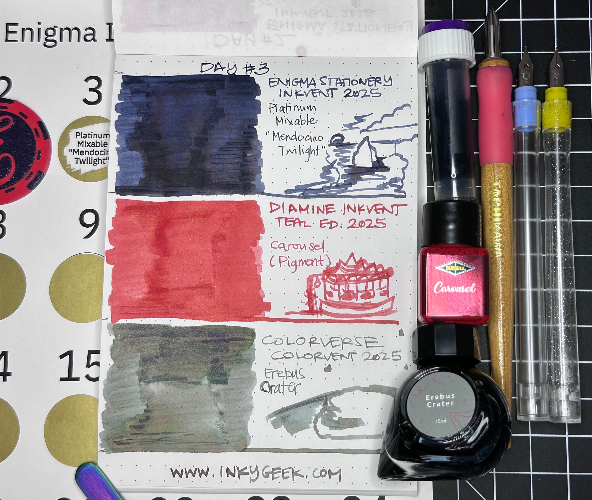
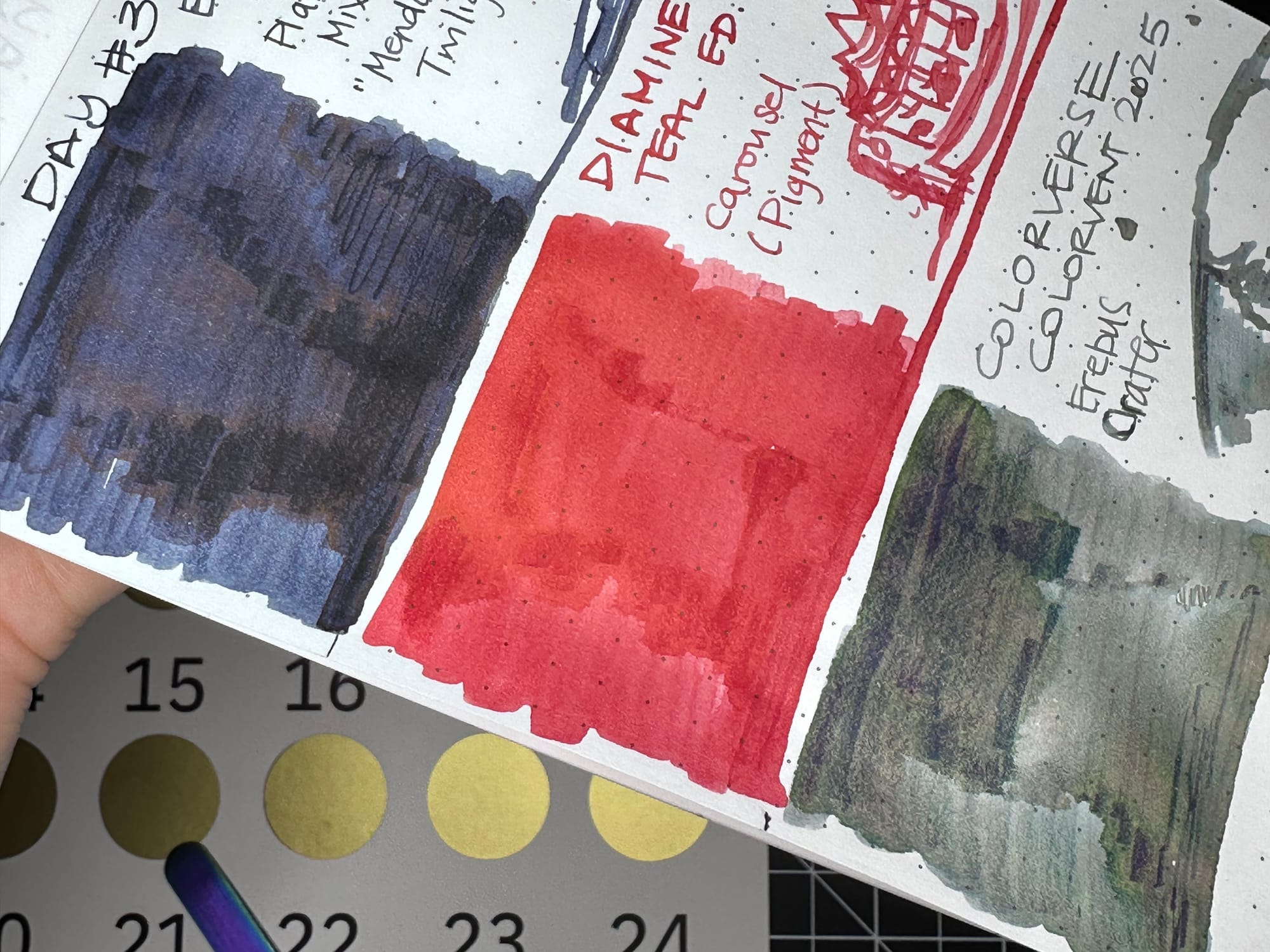
So first up is the Enigma Stationery Inkvent 2025 Platinum Mixable "Mendocino Twilight", which is a deep blue-black that the folks at Enigma mixed up themselves from the fun set of the Platinum Mixable inks. The exact formula won't be announced until later, from what I've read. It's a deep navy blue, with black and some hints of red sheen if seen in the right light. There are some areas of lighter saturation that are almost a blue grey. It's a surprisingly nice, solid, blue-black or dark blue. I'm looking forward to the recipe for this one!
Next up is Diamine Inkvent Teal Edition 2025 Carousel (Pigment) in red. This is a first for Diamine, including a pigmented ink in their Inkvent. It's a watery, sort of insipid red, but that kind of comes with the pigmented ink for use in pens territory. I didn't have any feathering or issues rinsing it out of my dip nibs (I do have feeds on the Sailor Hocoro pens to simulate a fountain pen). Diamine released their line of pigmented inks earlier this year, and from what I've read, the reviews are mixed. I think it's good they put one in the Inkvent to expose more people to the idea of pigmented ink, this one just doesn’t really do it for me. If it's touted as water-resistant (I didn't test it), it would be good for addressing those last-minute holiday cards.
Last ink up is the ??? standout, Colorverse Colorvent 2025 in Erebus Crater, a multi-shading olive-ish grey that dries very strangely. The multi-shading shows up as it dries, it goes on the page just a flat grey-green. There's pink, green, blue and even some yellow in the large, dense swatch. It took quite a while to dry. The overall impression is a greenish-grey in the fine nib text and in the larger, wetter areas it comes off as brown-pink. I do love a weird multi-shading multi-chromatic ink, this one starts out a bit light feeling, but dries down very legible and if used in a broad nib or a wet medium, would make for some definite entertainment. I'm sure there's a Sailor ink that is like this, too, but I can't decide which line it'd be from. There's a lot like this. The door for this one says "Erebus Crater
At the southern edge of the red planet, Opportunity once sent a photo from a wind - carved, greenish crater."
Next up is the Greenleaf & Blueberry Watercolour Advent in shells, we have a warm reddish yellow.
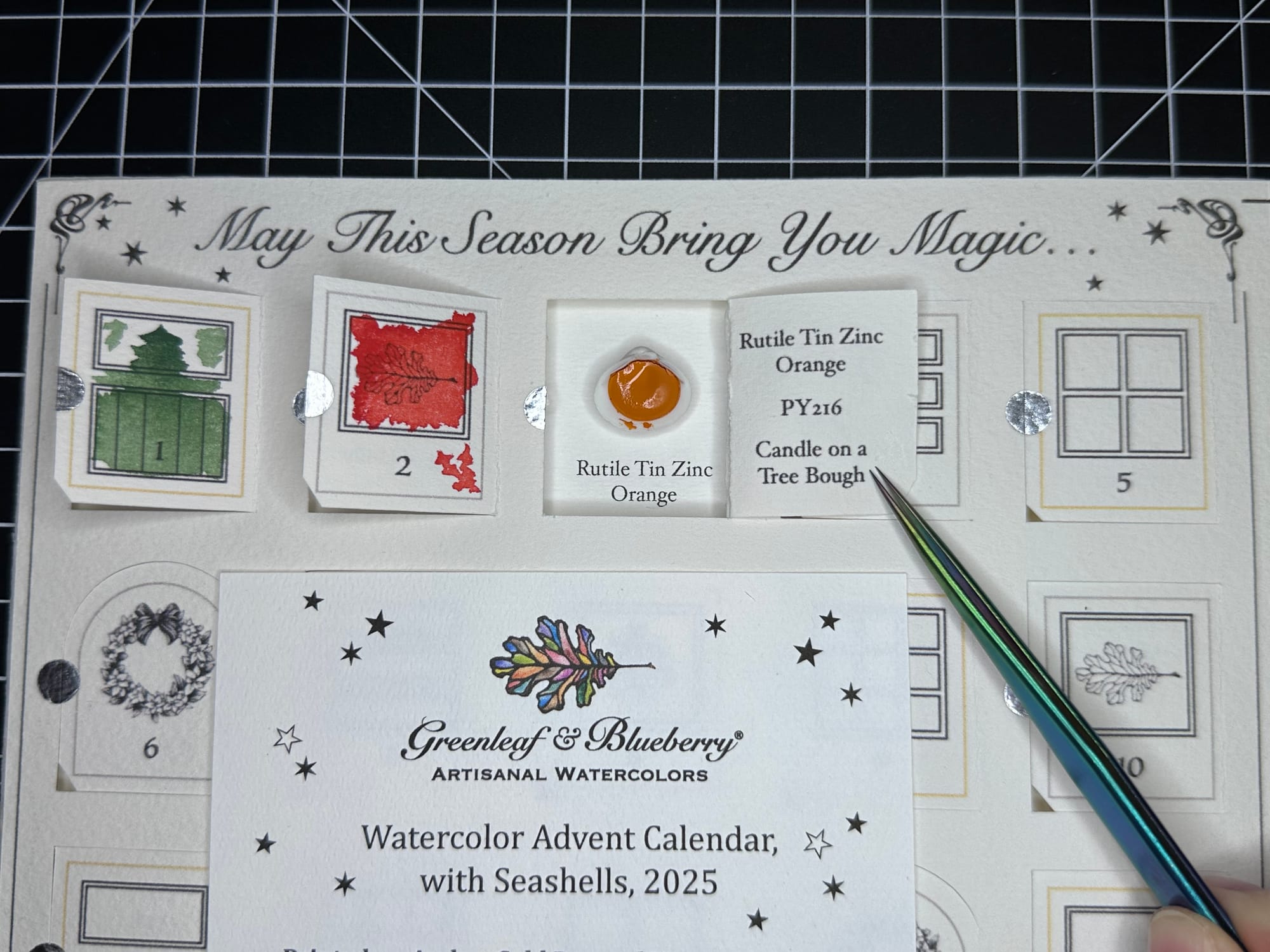
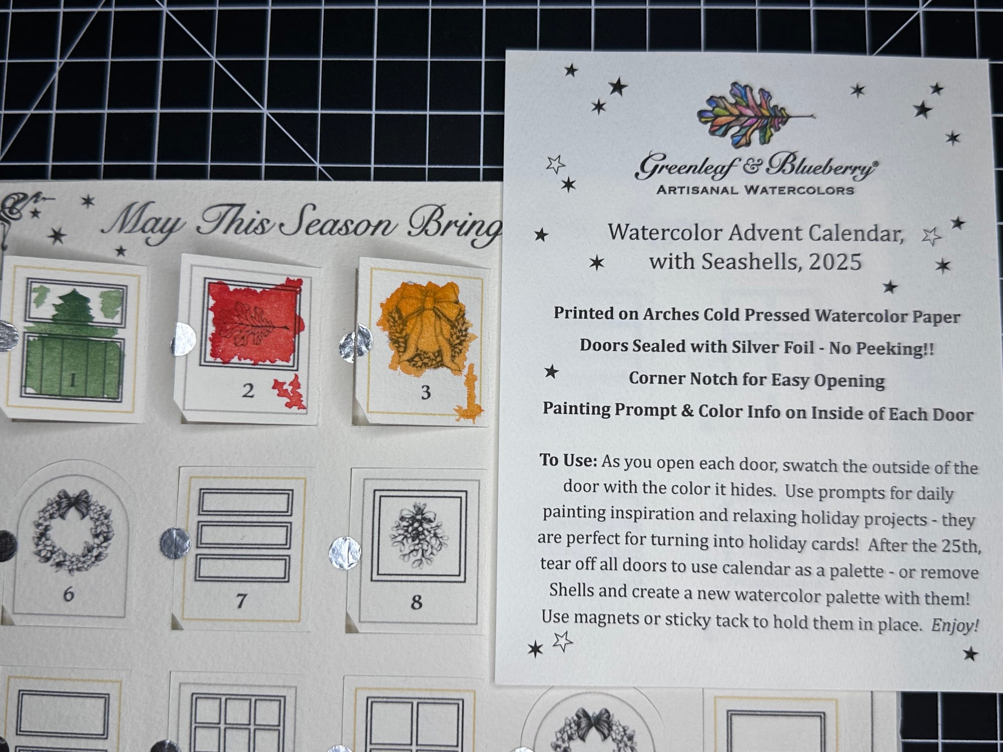
The Day 3 paint is Rutile Tin Zinc Orange PY216, which is a pigment yellow, but definitely leans toward the orange/warm yellow end of the spectrum. This pigment (PY216) is also sometimes called Turner's Yellow, after the chemist who created it. There's an interesting breakdown of the pigment at another blog, Idyll Sketching, that goes into more detail. The paint itself is really pigmented, it has a good amount of shading from the top of the wreath & didn't seem to granulate much in the swatch. It's definitely an orange-yellow-gold-ish colour, more than a straight up yellow. Very interesting!
Last, but definitely not least, is the Friday Afternoon Tea Teavent (Decaf Pyramids). I was a bit apprehensive for Day 3.
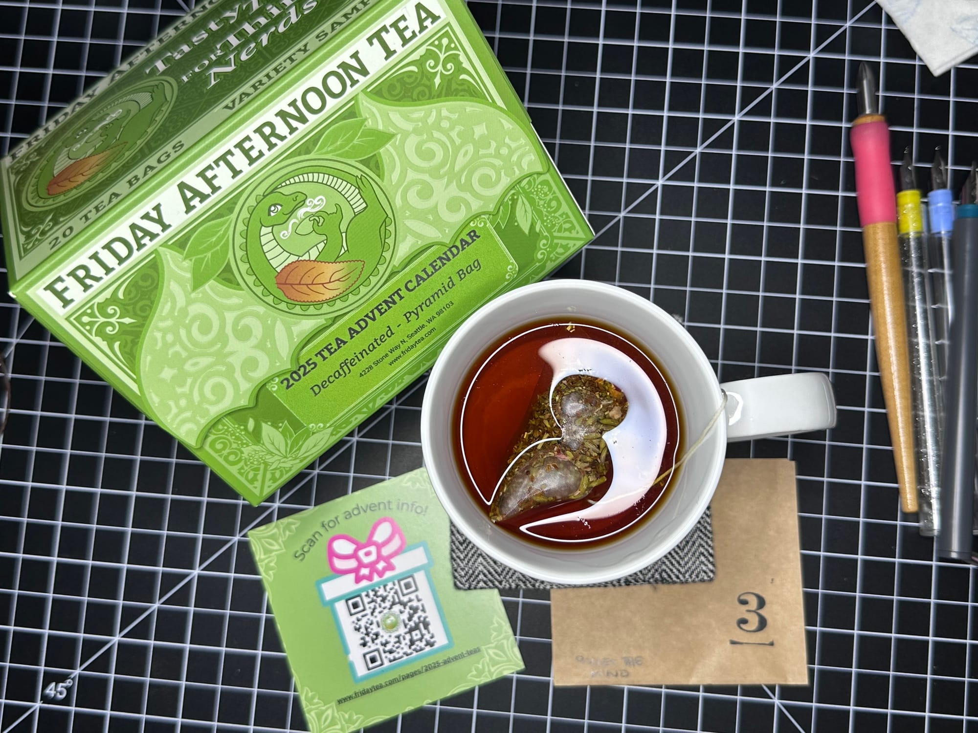
The Day 3 tea from the Decaf Pyramid set is called Quiet the Mind, and the part I was apprehensive about was how floral it might be. I'm not a fan of hibiscus or rose in tea (tisane), but I am going to set aside my issues for this Teavent. I steeped it a bit longer than recommended and it was definitely very herbally and astringent. I wasn't able to finish it (not due to not liking it, I just flaked out on the last couple glugs, letting it go cold & didn't want to re-heat it.) I didn't get a lot of the rose or the orange peel, I mostly got the lemon verbena and lavender, which isn't terrible at all, and I was thankful for it. I still have a sense memory I can't quite place for the smell/taste of this cup, but I've been trying for 3 days and cannot surface it. You'll have to try it and let me know what it brings up for you. It was definitely relaxing, but I don't know how much it quieted my constantly swirling mind.
Well, there we have it, Day 3 of Inkventpocalypse 2025. I'm just now a week behind, but I'm enjoying taking my time and doing the research and trying to learn all these new languages in these dark (figurative and literal) days of winter. It's extremely dry and cold here in Northern California and the sun sets very early, so I've been looking forward to my evenings of swatching and drinking tea, now I have this blog to put it all on, it has been very nice.
Thanks for sticking with me. Here's some questions I was thinking of when typing this up: Are there any colours you're looking forward to seeing? I'm finding the doodles for the inks very difficult this year, they seem to all be much more abstract than I'm used to (especially from Diamine!) What do you think about the inclusion of a pigmented ink? And are there any tea (or food in general) ingredients you just cannot handle, flavours that you avoid?