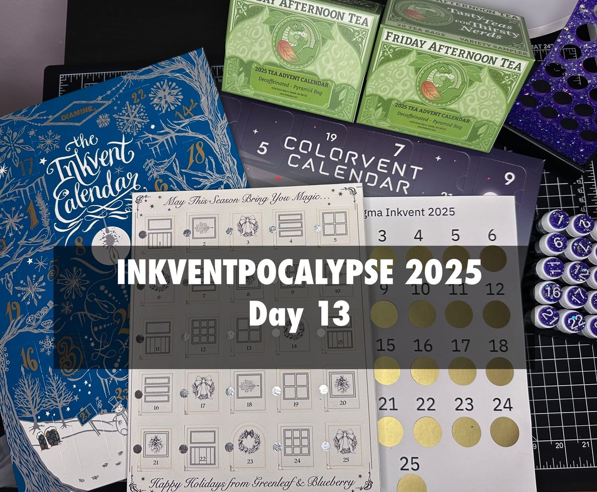
Inkventpocalypse 2025 Day 13
Well, here we are again! Day 13, on the last day of January (PST). I am still taking my time with these, there's no schedule. I will be starting #Roll_of_28 tomorrow, the first of February. I'll be posting a photo here (and maybe my Instagram, not sure) daily through Feb. Those posts won't be super texty. Things are already blooming around here (!) so I expect a lot of flower photos.
That out of the way, I'll just be sprinkling in these Inkventpocalypse posts as I get to them. I have no idea if these swatches will be relevant in March but who cares? This is my nonsense! I expect that the full bottle Inkvent releases will overlap my swatches with how I'm going. I'll post about the releases as I hear about them.
Before we get into the inks, I'd like to call out that Friday Afternoon Tea is a small independent tea shop, and like most small indie shops after the holidays have a huge drop off in sales. If you've been interested in any of the advent teas they currently have (they rotate things seasonally) or any of their teas at ALL please check them out, they are such a lovely and wonderful shop I want them to stick around so I can do their tea advent again for 2026!
Now, for the main event. Here are our Inkvents for Day 13.
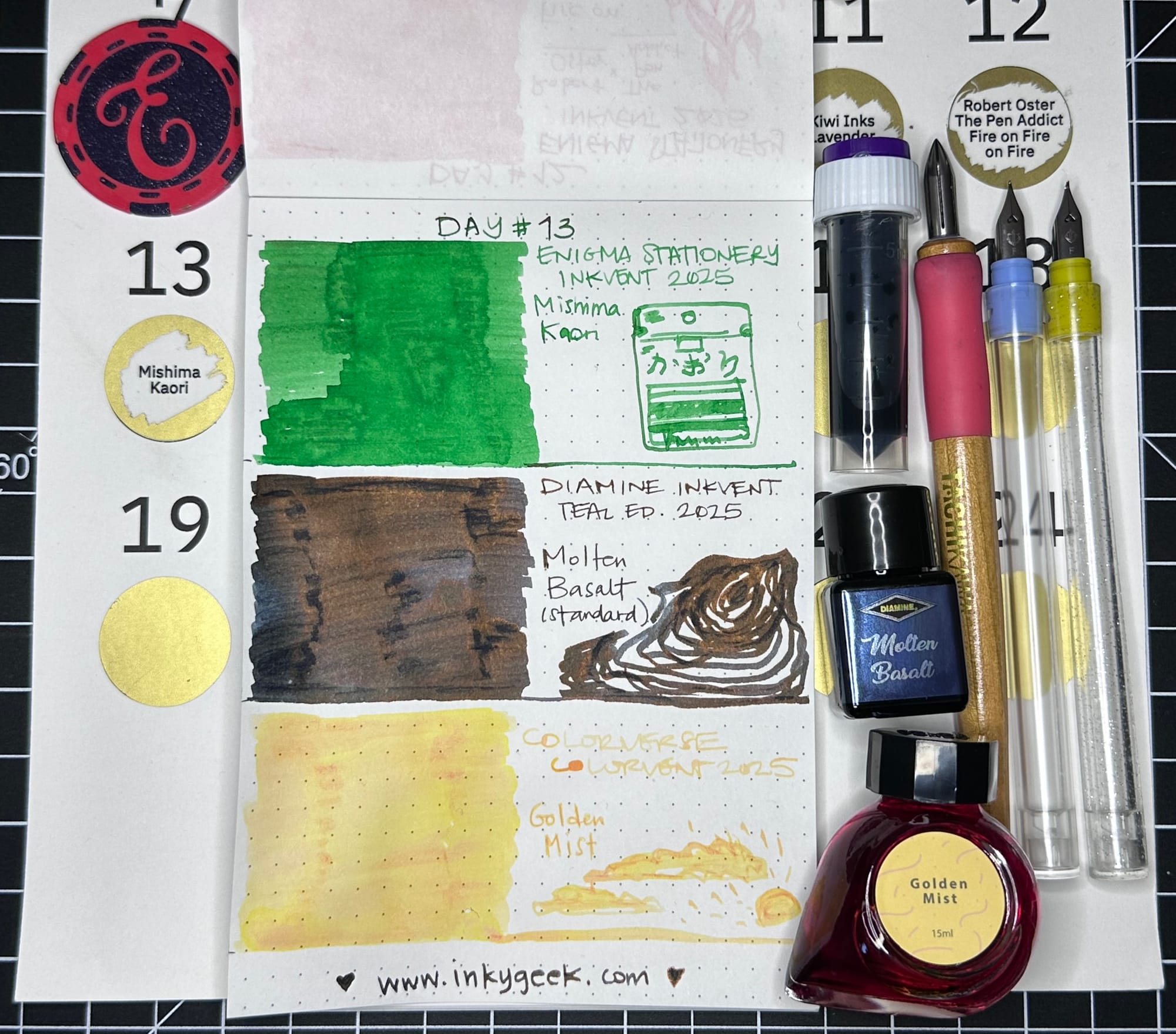
Day 13 is here with three "standard" inks, though the Diamine ink isn't fully a standard ink. Enigma Stationery's Day 13 ink is the second in the Mishima Rice Seasoning / furikake collaboration with Sailor inks. This one is a slightly yellow-leaning green ink. The rice seasoning is green perilla, Kaori (the one we had for Day 5 was red perilla, Yukari). It does have some shading and is a lovely neutral to yellow green. It made me think of Girl Scouts (I may have cookies on my mind.) I did a bit more specific doodle (with reference) of the green Kaori rice seasoning package this time.
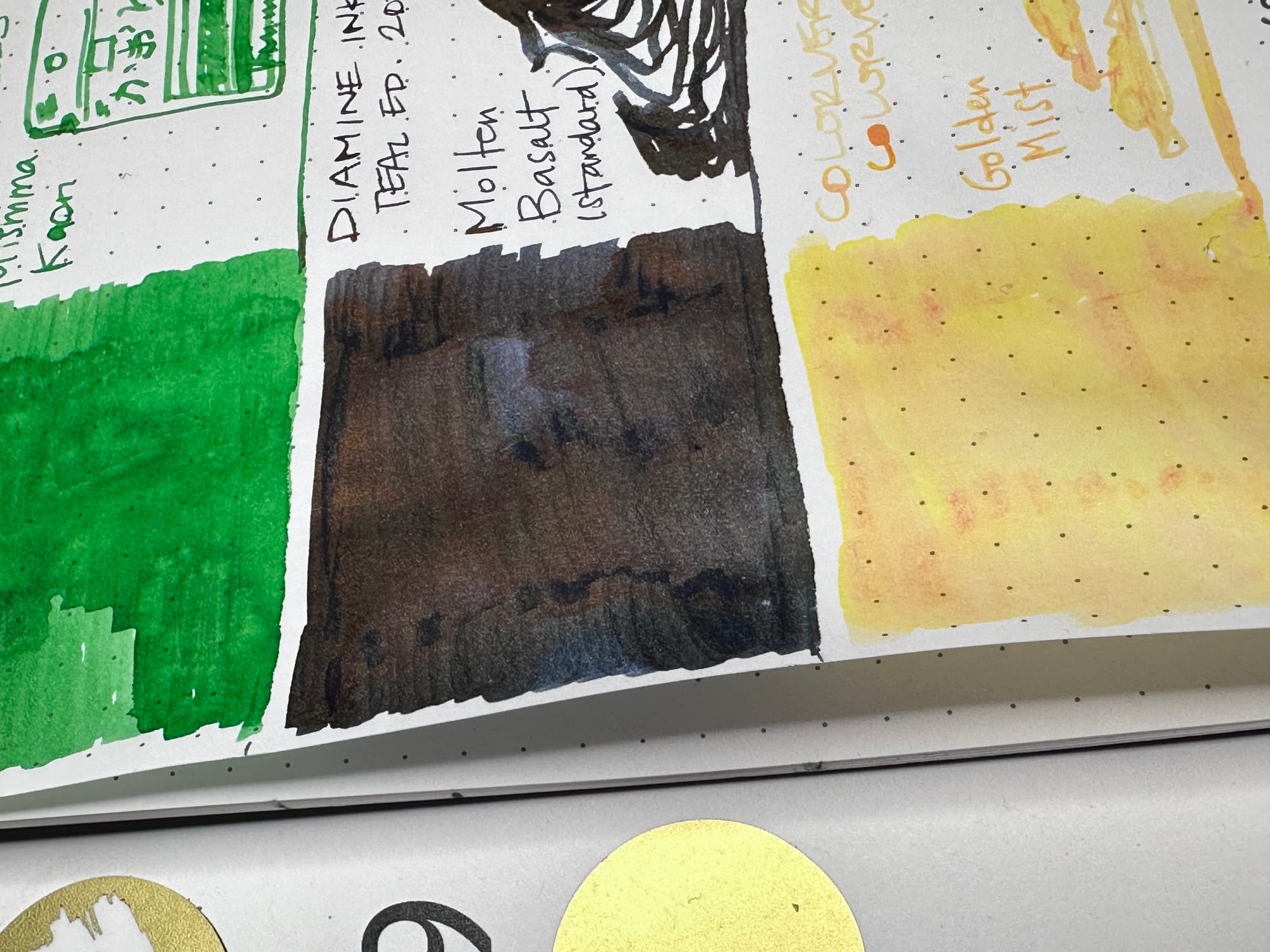
Day 13 for Diamine Inkvent Teal Edition is in Molten Basalt, labelled as a standard ink. I found, as photographed, it showed a lot of brown/black sheen and some lighter patches of shading. The overall colour is a dark, dark rich blue/navy-black that is hard to see with the sheen even in writing. It is an unusual sheening blue ink. Molten basalt is your gloopy, oozy lava, not the huge fountains of spurting boulder lava. I tried to doodle a lava floe, but it ended up looking somewhat like a mussel shell.
Colorverse Colorvent's Day 13 Golden Mist is a strange one. It's very pale and desaturated, and has these pools of orange-red-pink that appear as it dries. It's not entirely illegible, and doesn't give the same, uh, organic vibes as Day 7's Diamine in Blush as the base colour is a bright, warm yellow. I don't really know what to do with this one. It's so very light. I can't imagine what sort of pen it would work in, aside from using for highlighting or ink painting. Which is a totally valid use. I do appreciate ink makers taking risks like this. I tried to doodle a misty sunrise. The door to Day 13 says simply, "Golden Mist: Particles in the air scatter sunlight into a veil of golden haze."
Next up is a really fun (and VERY expensive) watercolour from Greenleaf & Blueberry.
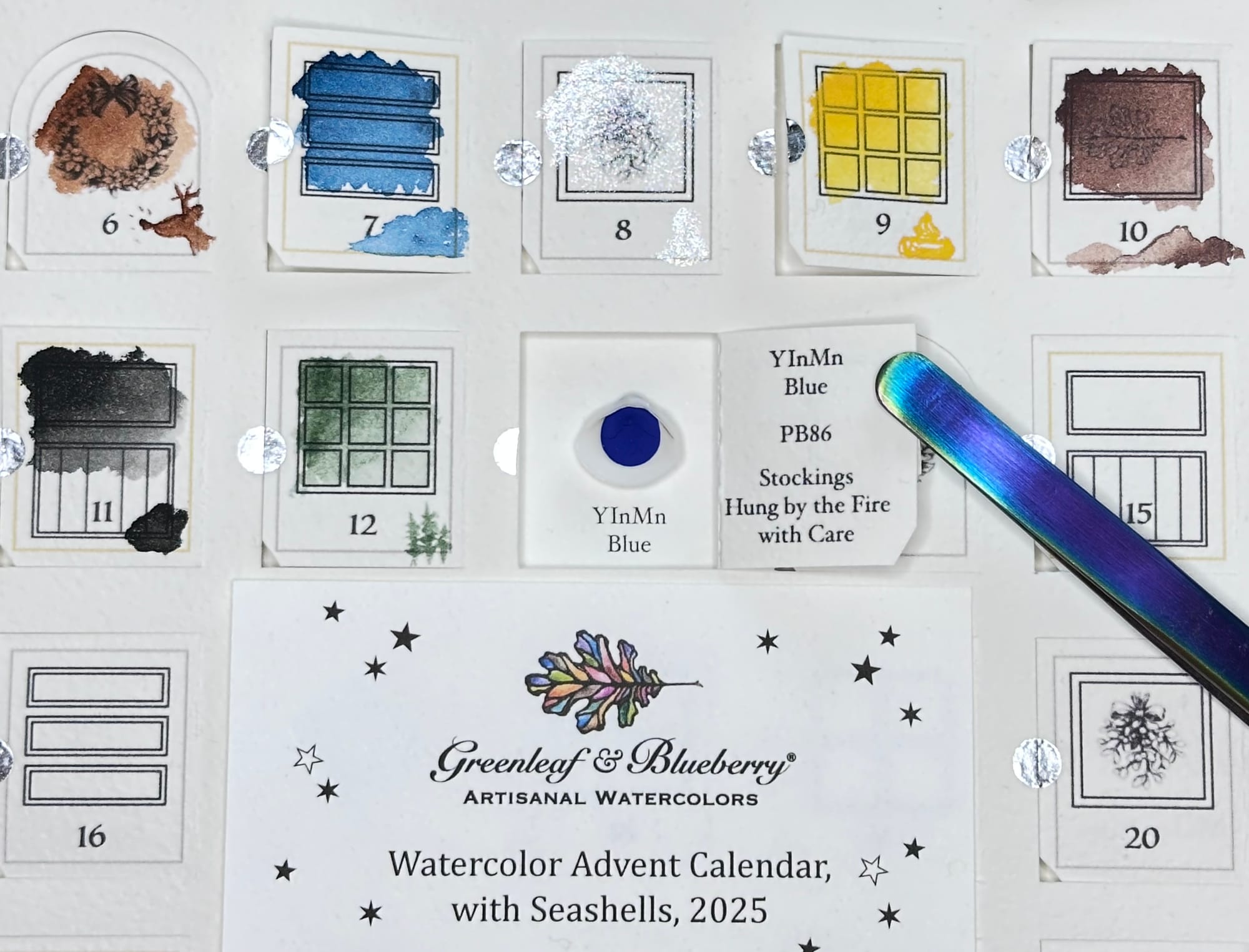
Day 13 in the Greenleaf & Blueberry Watercolour advent in shells was a real surprise! It's YInMn Blue, one of the most recent blue pigments discovered - in 2009! It's named for the components that make it up: Yttrium, Indium, Manganese. It's a very new, very vibrant, and very expensive pigment. The story of it's discovery & the subsequent commercialisation (some guys always gotta make number go up) is worth a deep dive. It's labelled as PB86. Here's an in depth review of another watercolour's brand from Parka Blogs that talks more about the pigment.
It's a really matte, strange-looking paint in the shell. It doesn't seem to reflect light the same way as the other pigments. It's a deep, clear, true blue colour in the pan/shell.
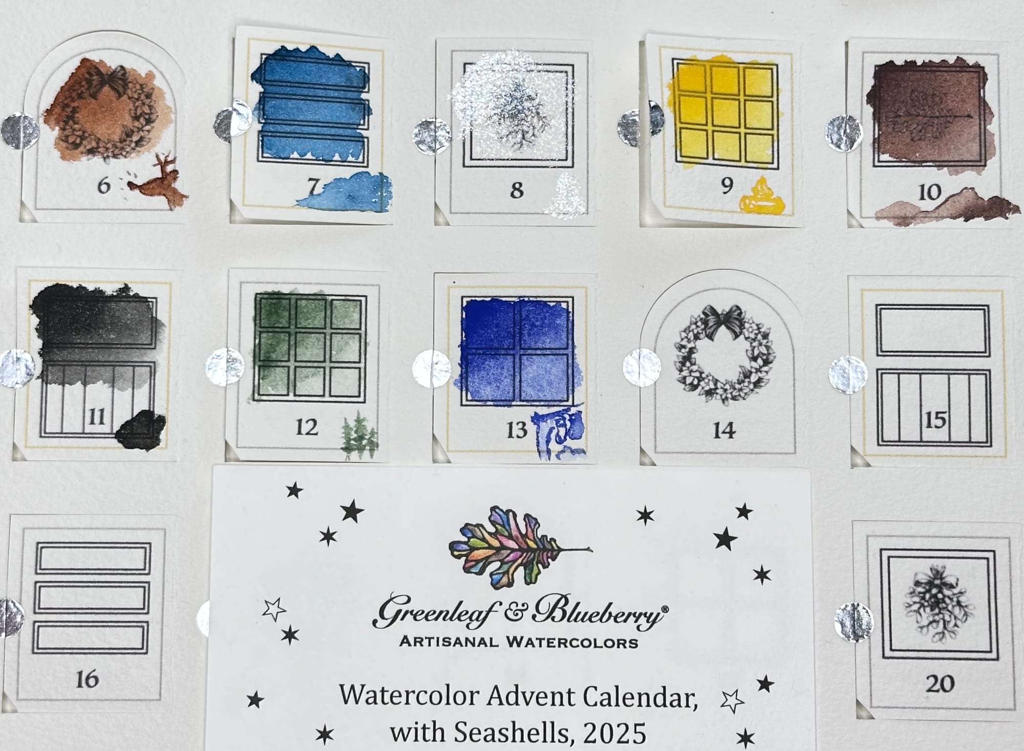
When wetting the paint, it was instantly obvious it's a tremendously saturated paint. It only takes the tiniest amount of water to load the brush with pigment. It is a very fine pigment particle, almost like a dye, and behaved very differently to any of the pigments thus far. It wasn't hard at all to control, to get the tiny little stockings and to dilute the paint on the brush enough to get the lighter areas. I am baffled with how to describe how it felt on the brush. It was such a pleasure to use, I am going to have to find lots of ways to use this, somehow. I am super curious how it plays with mixing.
Lastly, we have Friday Afternoon Tea decaf Day 13 Tea advent in bags.
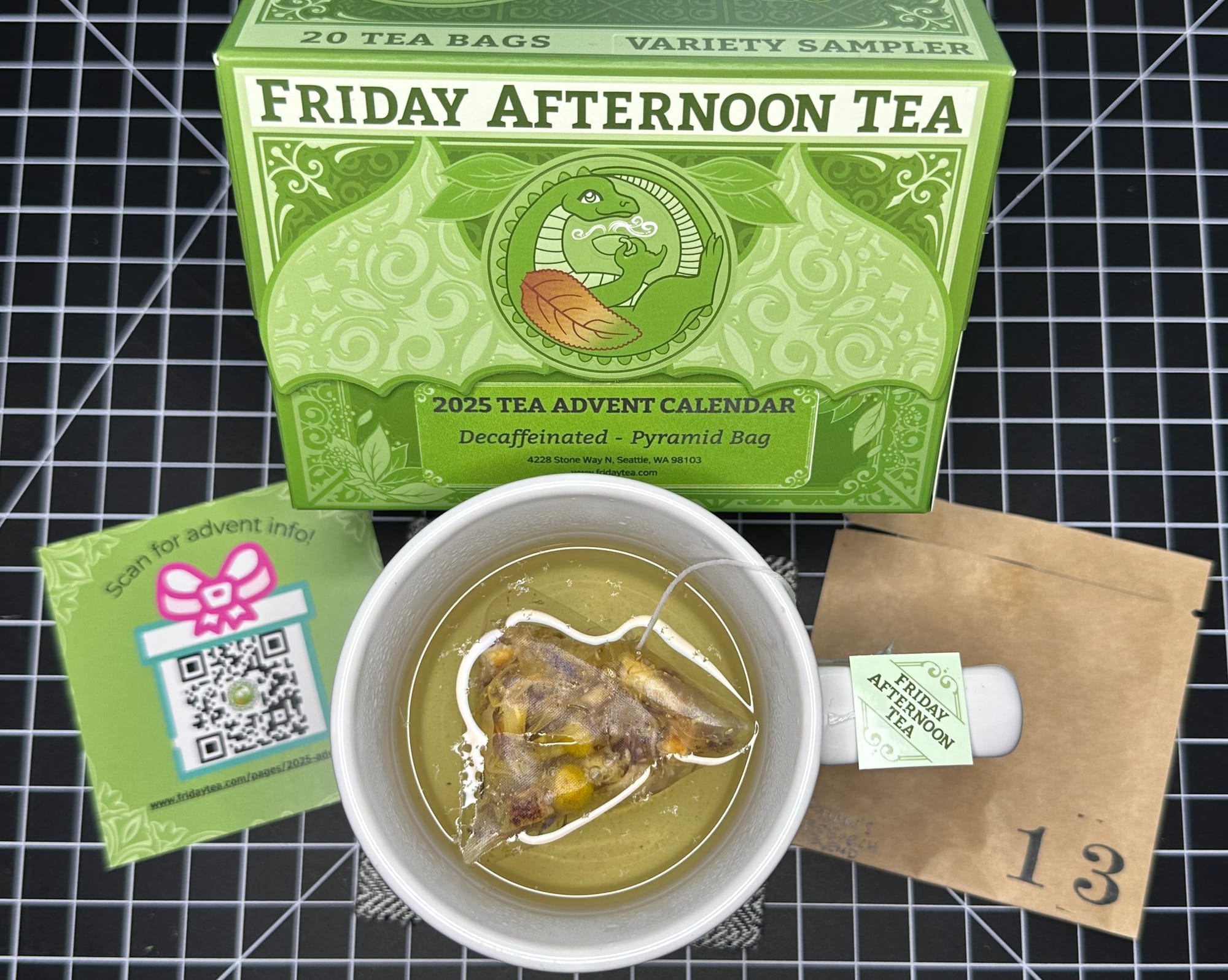
Day 13's decaf tea is a ChariTea called Rohan's Research Blend. It's a really pretty tea - blue cornflower is purple in the bag (note the bits in the water aren't dust or fluff, but oils and finer particles from the tea itself) that is gentle and sweetly floral. Note, the link to the blog post about the blend on the tea's page isn't for this one, their blog post is here: https://www.fridaytea.com/blogs/fridays-blog/btb-rohans-research-blend
The ingredients are: love, apple, blue cornflower, orange peel, chamomile, marigold, natural vanilla and lemon flavouring. The bag of tea smells divine, like a floral ice cream. Something I'd want to wear as a perfume. In the cup, it's less sweet than it smells and tastes more floral, but not the cloying floral of rose teas. Part of every purchase of the ChariTeas goes to charity. I did drink all of this tea myself, it feels like spring in a cup.
Well, here we are at the end of a long post (sorry, not sorry. This is why I needed a blog!) and at the end of a month that felt like a whole year. I hope this finds you well, your city un-encumbered by extra wintry weather (and ice) and may your February be filled with gentle discovery and small bits of joy. I had a ton of questions to ask when I was typing this up, but I have lost them all to the aether.
I'll leave you with this (multifaceted) one: it is probably pretty clear how I feel about teal blue sheening inks by now, but I don't entirely feel the same way about blue paint and blue bits in my tea. Does how you feel about a colour (or experience) change with the format it's presented in? Do you like one type of blue more than another, or a certain finish of blue (sparkles make anything better) more than another? Did you know about YInMn blue?
Thanks for reading,
subgirl, your resident inkiest of geeks